If you’re running traffic to your online store and HAD to do one thing to increase your sales TOMORROW, here is where I’d start…
Your Landing Pages.
I.E. The first page a visitor sees after they click on one of your ads.
Best of all, this works for e-commerce owners, digital product owners, and SaaS companies. Even if you run a physical business and you sell products online, this will work for you too.
If you sell online, this will help you grow your business.
Let’s jump right into the first step…

Plug the Holes
If you read the first post about 2X’ing your business, you know the first step is to plug the holes in your leaky funnel.
Plugging the holes will stop leads and sales from escaping your funnel like water out of a leaky bucket.
There are a few ways you can do this (email is a great one that we’ll get to in the next post). But, the best place to start is with landing pages.
You’re spending money to get people to your landing page every single day. And anytime you’re not getting the full bang for your buck, it’s like having a bleeding wound.

When you bandage that wound you start getting better ROI from your ads.
If your business is already profitable, and you’ve been running ads this way, great. Everything you’re about to learn is going to add rocket fuel to what you’re doing.
Why start with fixing your landing pages?
First, it’s going to stop visitors from leaving and leads from not entering your funnel.
Second, they’re easy to change and test.

- You can change videos
- You can change images
- You can change the words on the page
- You can change the layout
And third, you see results fast.

Whether you’re spending $100 a day or $10,000 a day on ads, you’re still spending money every single day. As soon as you make a change you start to see results.
Let’s get into the details of how this works.
The number one thing I see wrong with most landing pages is The Offer.
I.E. What is the THING people are getting in exchange for giving you their information?
Or, opening their wallet and buying something?
Let me give you an example of how I’ve failed at creating a really compelling offer. At the time I was working with a client named, Larry, the founder of a business in the homeschool space.
Larry told me that kids who go through his homeschool kits do really well in college. He’d even gotten kids into Ivy League schools. So, I thought the offer was “How to Raise an Ivy League Kid.”
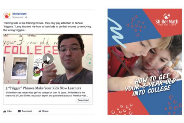
The ad we created was great, got very good engagement, and a low cost per lead. But we weren’t turning a lot of these leads into homeschool kit buyers.
We could never get this funnel to work as well as we liked. We ended up shutting it down even though the ad did bring in leads.
The problem was that getting into an Ivy League school isn’t, as Ross O’Lochlainn says “a bleeding neck problem.” In other words, parents aren’t thinking “I need my child to go to Harvard or something terrible is going to happen.”

Kind of obvious in hindsight.
What was the real “bleeding neck problem” for parents? Surprise, surprise, they need to keep their kids entertained.
When we changed the tripwire offer to “18 hands-on printable garden activities that you could do with your kid”…it opened the floodgates.

How’d we figure out what the “bleeding neck problem” was? It’s a simple trick. We googled “best homeschool math kits.”
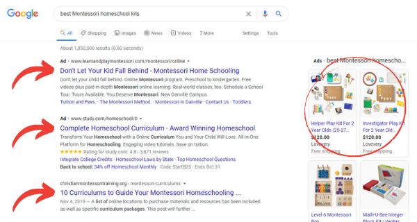
We searched “best Montessori homeschool kits” and we looked at the mom blogs, and what do you know?
What we found were pages and pages of homeschool mom blogs offering free printables. Three-quarters of them offered activity packs. Some were even SELLING these printables for $5-10 each.
We started offering free activity packs teaching parents and their kids how to identify common flowers.

We put that on Facebook and our engagement went through the roof. It did better than the old offer by a factor of three because we found that thing that parents needed fixed right away.
All we had to do was take a few lessons from our math kits and link them to our printables. After that, it was an obvious next step to get them to to get the kit.
You can do the same by Googling “best (your product or your service).” Then see what comes up in the ads, or in the organic search results.
What are those landing pages and blog posts about? What are they offering people to buy or opt-in to?
This is what we call competitive analysis and it lets you see all your competitors’ offers.
The next thing we do to fix on your landing pages is congruence.
Let me show you what bad congruence looks like. This is from Lowe’s, one of the biggest home and garden businesses.
The top image above the arrow is the ad.
The bottom image below the arrow is the page that the ad takes me to:
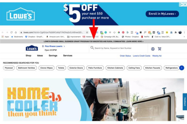
Let’s say I’m interested in $5 off my next $50 purchase so I click on the ad. Where does it take me? The homepage…
As far as I can tell, the only things that are the same are the color scheme and the logo. That’s it.
There’s nothing on the homepage that says “Enroll in MyLowes”. There’s nothing about the $5 off, nothing. I don’t even know if I’m on the right page.
That is the worst thing you can do. Show someone a great offer and then dump them on your homepage. I see this happen all the time. All it does is piss off your visitors and make them click away from your site.
Let’s take a look at an ad and landing page with good congruence from the mattress company Purple.
The image to the left of the green arrow is the ad. The image to the right is the page you end up on.
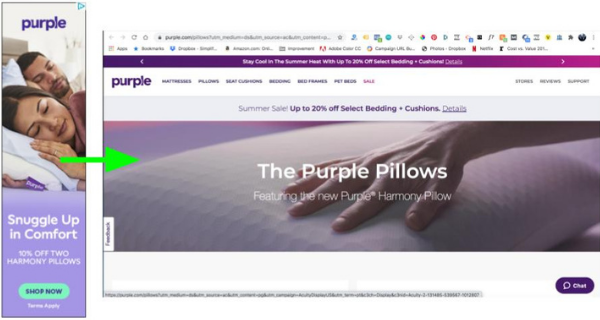
They’re offering 10% off their Purple Harmony Pillows and the call to action is to “Shop Now”. When I click through, BOOM, I see the “Purple Harmony Pillow” right there.
It’s what I was looking for. The branding’s the same, the offer’s the same. Even the fonts, colors, and buttons match. It’s congruent.
When I scroll down:
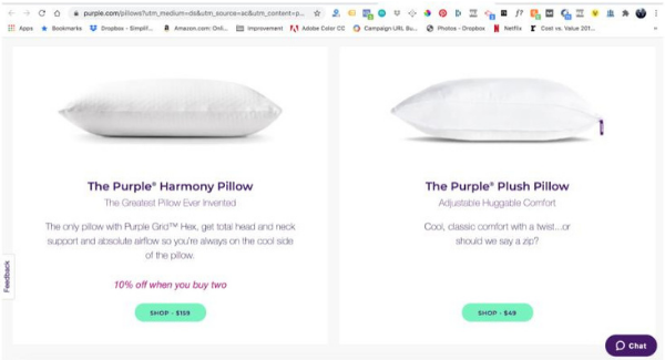
There it is, the purple harmony pillow. And it’s 10% off when you buy two, just like the ad said.
It matches. That’s how you do good congruency.
The third thing we do to improve landing pages, is to make it easy.
I want to make the next step for your customer easy. That means it shouldn’t require them to jump through a lot of hoops (i.e. put a bunch of information in a form).
Let’s take a look at SEMrush. They sell a SaaS subscription product for search engine optimization research.
When I clicked through their ad it takes me to this page:
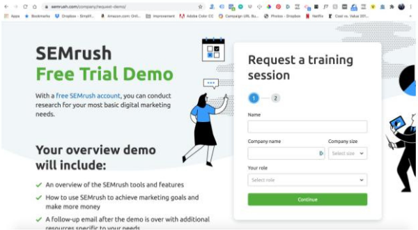
It’s a really nice, simple, easy to use page. The “request a training session” sign up is right there.
They’ve got a list of benefit bullets that’s reassuring me what I’m going to get in my demo.
The signup form is short and easy to fill out.
Plus, even though there are TWO steps I know where I’m at in the process because of that highlighted blue bubble. I feel like I’m on the right track:
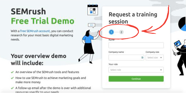
SEMrush did a really good job.
But let’s take a look at another bad example.
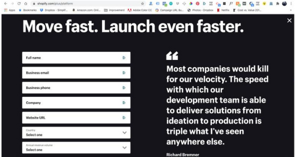
This is a landing page for Shopify Plus. I clicked on one of their ads that enticed me to download a free report.
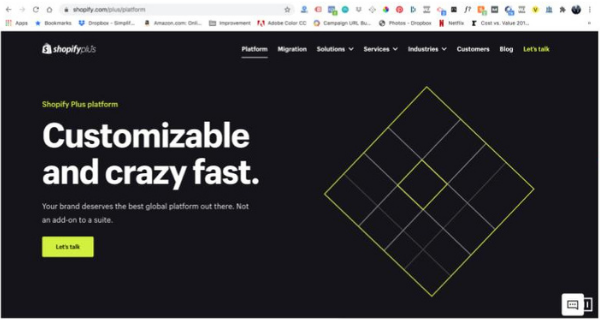
When I click through, there’s almost no congruence. The branding, logo, and colors are the same, but that’s it. The offer is not the same.
^^^ There’s nothing on that page about the free report. ^^^
Not only that, but when I click the “Let’s talk” button on their page, this is what they wanted me to fill out:
HOLY SMOKES.
I don’t have all day to fill this out and neither do your customers or your prospects.

Sometimes you can’t avoid asking for a lot of information. For example, if you’re doing a free plus shipping offer. Your shopping cart needs to have a billing address and shipping address.
But, if you’re JUST acquiring leads, this makes no sense.
Shopify Plus is asking you to fill in… EIGHT different fields. It’s very overwhelming and feels like a lot of work.
There’s one more a cardinal sin here that I don’t like to see. One I’ve learn the hard way in the past…
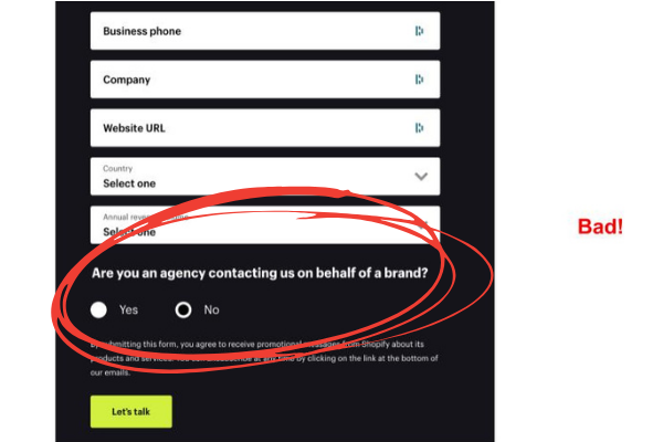
That “Are you an agency” question is brings up an objection.
You almost NEVER want to do this inside of a lead gen process. The objection that immediately comes up in my mind is, “Are they going to reach out to my client if I ask for some information?”
This brings up an objection to even getting on the call. The only reason they might do this is to disqualify people from entering the form.
(This CAN be a good thing for qualifying prospects.)
So there you have it folks. Those are my three steps for how to improve your landing pages:
- Find out what offers are working in your market
- Make your ads and landing pages congruent
- Make it easy
Here’s my suggestion for going through these three steps for your landing page.
Set a time for 30 minutes, and then go through the following steps.

1) Competitive Research
Do a web search for “best + your product/service.” Whether that’s homeschool math kits, motorcycle jeans, dinosaur teeth, or gifts for dads.
Click on the top ads and find out what three of your competitors are offering as an optin.
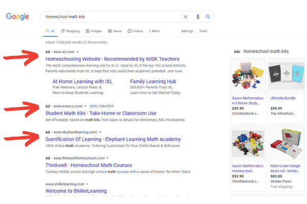
Are they offering giveaways, free products, a 10% off coupon?
This is going to give you ideas for a good offer that your audience wants. Because your competitors are not going to be advertising if it didn’t work.
2) Congruence
Take a look at your ad creatives, the images, videos, and copy.
Look at what ads are doing well. Then build a landing page JUST for that ad. You want it to look, feel, and sound the same.
That’s what’s going to reassure them that they’re in the right place. As one of my past clients Ian Stanley says, “you’re leaving the cheese for the mouse through the maze.”

You want to help guide your prospects through the process. Make sure the images, video, and big idea from the ad match what’s on the landing page.
Don’t be like Lowe’s or Shopify Plus. Offer something and talk about it on the landing page.
Don’t be that business that puts up an ad that directs to your homepage. It’s a waste of ad money.
If you fix any congruence issues from the ad to the landing page, the landing page will perform way better.
You’ll get better customers because they’re better qualified.

3) Make It Easy
Go through your own opt in process on both your phone and your computer. This is really important because they’re going to look very different. It can be a totally different experience.
Most traffic these days is going to come to your site on a mobile phone. So always be sure to test your site or landing page on at least one mobile device.
As you go through the opt-in process, write down anything that’s confusing, hard, unclear, or boring. (CHUB)
There are some technical aspects to landing pages. That’s why I add hard to this list.
If you have people clicking through to another site. There are multiple steps to your form. Or your form doesn’t show up the right way on mobile versus desktop.

Make sure to fix those things. This will decrease friction and make it easy.
It’s also super helpful to watch other people go through your opt-in process. Ask them what they find to be confusing, hard, unclear, or boring.
You know your business. But there might be some wording that you understand that your prospects do not.
So, that’s it. I’m very excited to hear how your landing pages are looking after this.
I’d love to see some before and after screenshots if you’re willing to share! Leave a comment below if you thought this was helpful. Let me know what your biggest takeaway was, and how your homework went.